From concept to code
Reimagining my personal brand and building a portfolio with AI
- Creative direction
- Brand identity and visual design
- Experience design
- UX, UI and interaction design
- AI-assisted development
- Claude for creative exploration and design development. Claude Code for building the site.
- Delivery
- Live, deployed website
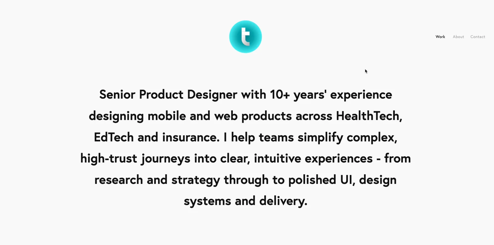
My original portfolio and visual identity no longer reflected the designer I'd become.
With over a decade of experience across product design, UX and visual design, I wanted to create a more distinctive digital presence that better communicated my approach, showcased my work and reflected the direction I wanted to take my career.
Rather than simply refreshing the existing website, I decided to rethink the entire experience, from the brand identity through to the underlying digital experience.
Establishing a new creative direction
I started by exploring how I wanted my personal brand to feel and what I wanted it to communicate.
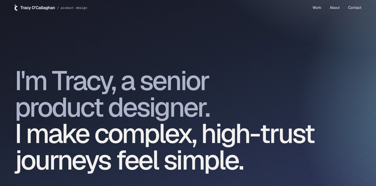
I led the creative direction throughout. I developed the gradient and grain texture myself, and used Claude to explore new logo directions and ways to extend the palette. In the end, the identity that felt right was an evolution of my own mark.
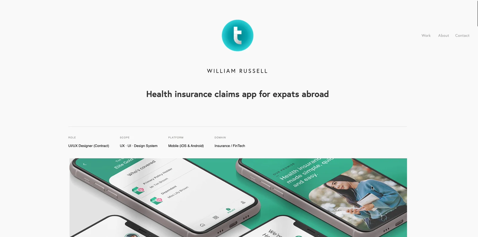
The new direction moved away from the bright turquoise of my original branding towards a darker, more editorial aesthetic, introducing a restrained purple accent palette, considered typography and a more expressive visual language.
The objective was to create an identity that felt personal without distracting from the work itself.
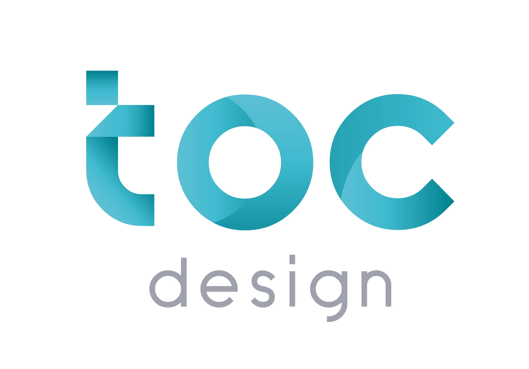
An evolution, like me.
The logo is mine. I designed it over 10 years ago, and it's simply an evolution, like myself. A work in progress.

Built on a 10-unit module.
- Square · 10 × 10, the same width as the stem
- Crossbar · 11 × 10, cut at 45°
- Bowl · inner radius 7, outer radius 17
- Fold · a soft shadow where the stem tucks under
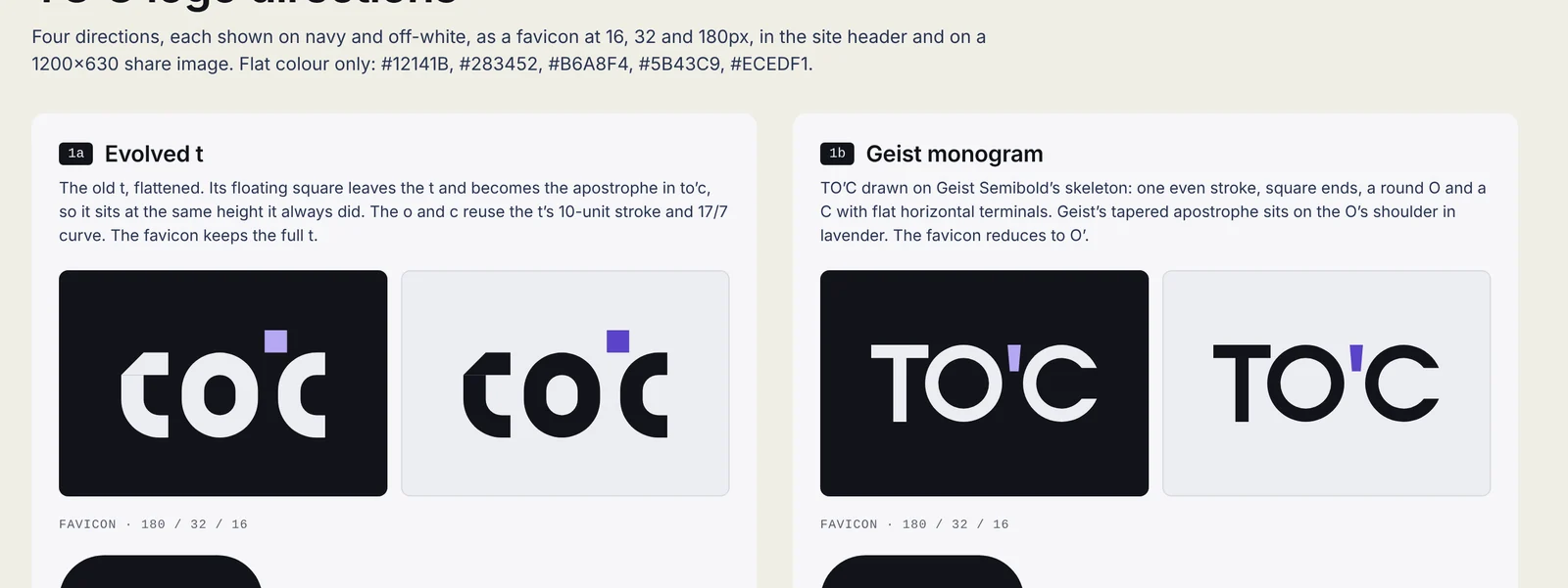
New directions, set aside.
I explored new branding options with Claude, but I wasn't happy with the outcomes. None of them felt like mine, so I came back to my own logomark and set it on the gradient and grain I'd developed.
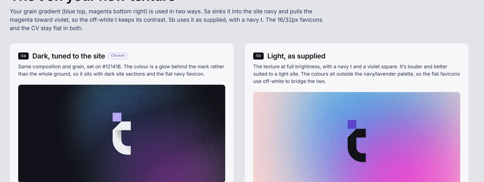
Colour, grain and type
I developed the gradient and grain texture, then used Claude to explore extending the palette around them.
#12141B
#283452
#B6A8F4
#5B43C9
#ECEDF1
One identity, every touchpoint
Designing the digital experience
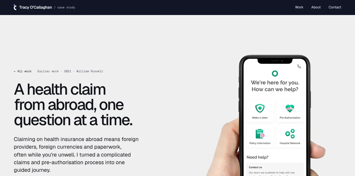
I established the creative direction and design principles, then used Claude to explore and develop the website experience. I directed the visual execution, making the decisions on layout, hierarchy, navigation and interactions.
I considered how the brand could translate into the digital environment, thinking through content hierarchy, navigation, layout and how best to communicate my experience and design philosophy.
The focus was on creating a more intentional portfolio experience: one that prioritised clarity, personality and storytelling over a conventional grid of projects.
The small things
Motion on the site is quiet and quick, and only there to confirm something happened. Every animation switches off when Reduce Motion is on. Try them here.
Cards answer the hover
The title turns violet and the arrow nudges 6px. 200ms, ease-out.
Numbers count up once
Stats count up when they first scroll into view, then stay put.
Got
a complex service
that needs a senior designer?
One word at a time
The footer headline swaps a single phrase, rolling up out of view and the next one in.
The logomark builds itself
Stem, crossbar, then the square drops into place.
From design to code
Rather than following a traditional design-to-development handoff, I explored an AI-assisted approach using Claude.
Working through prompts, I translated the creative direction and design decisions into a working website, using AI to generate and refine the implementation.
This allowed me to move directly from design exploration into a live build, evaluate the experience in context and iterate on the results without relying on a separate development handoff.
I could experiment with ideas, refine the visual details and see how design decisions translated into the actual product.
Shipping the experience
The result was a completely reimagined portfolio and personal brand, designed and built independently and deployed to my own domain.
The project gave me the opportunity to take ownership of the entire journey, from the initial creative concept through to a live digital experience.
This project changed how I think about the relationship between design and development.
Working with Claude gave me a more direct way to turn ideas into working interfaces, and shortened the distance between exploring a design and building it.
But it didn't replace the craft. The creative direction, the brand and the judgement on what's good enough were still mine. AI can build quickly, but it can't decide what's right, and it doesn't notice when something feels off.
For me, the opportunity isn't to replace craft, creative work or engineering expertise. It's to expand what designers can explore, prototype and deliver on their own.