I redesigned an app students only opened when they had to.
BPP's learner app was a shell that sent 50,000+ students off to web platforms. I led design from research to launch, and changed what the app was for.
- Role
- Senior product designer, sole designer on the team. Co-led research
- Organisation
- BPP Education Group
- Platform
- iOS and Android
- Team
- Product, engineering, service design, delivery, analytics
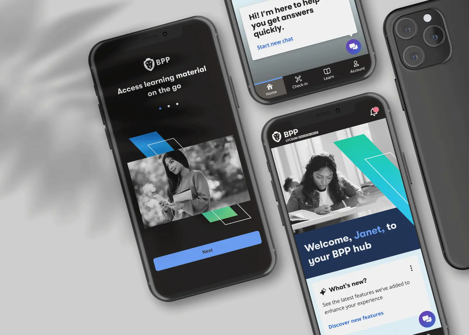
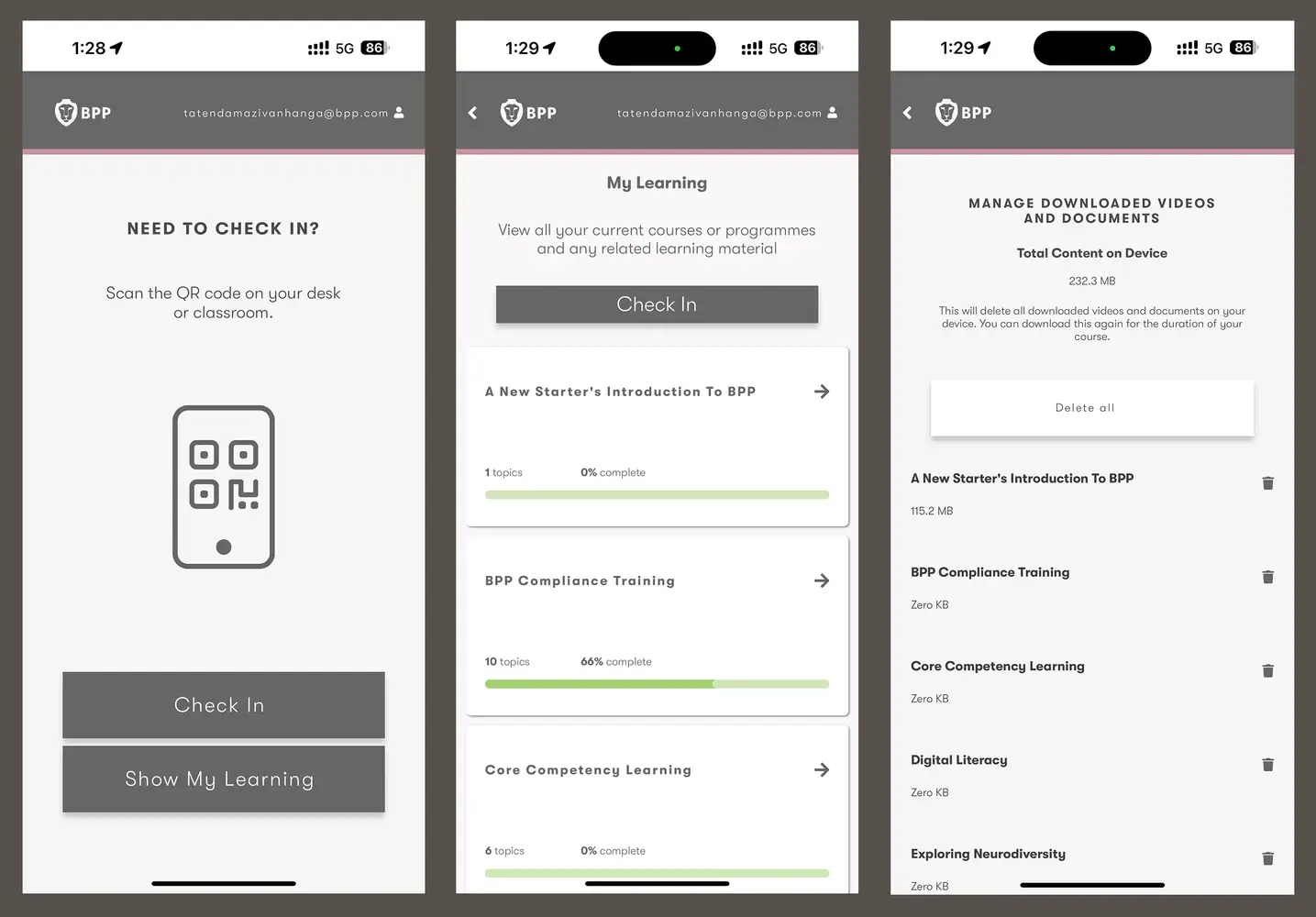
The app wasn't really a mobile product. It was a set of links.
Nearly every task sent students somewhere else. They jumped between systems, searched instead of being guided, and left the app for basic tasks.
Designed around four things students actually need.
- 01PlanWhat’s happening? → Timetable
- 02Stay informedWhat’s changed? → Notifications
- 03ManageWhat do I need to do? → Check-in and My Account
- 04Get helpWhere do I go? → Support and chatbot
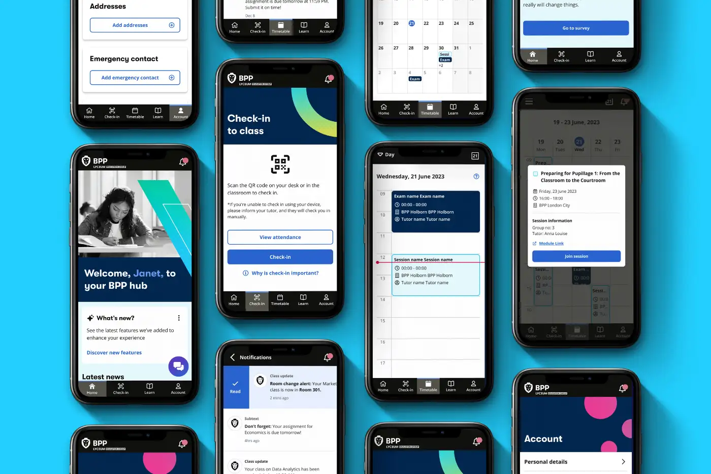
Check-in
Check-in ends on a clear confirmation, which students called reassuring in testing.
Notifications
Urgent alerts like room changes are sent straight away. The rest is left to the student.
Good strategy is knowing what not to build yet.
I prioritised by three things, in this order.
- Daily value
- Technical feasibility
- Feature parity
What shipped when
What waited, and why
The biggest challenge wasn't the UI, it was ownership.
No one owned the content, and outdated information loses trust.
The decision: marketing owns the content, with self-service publishing for university-wide announcements.
How this project changed the way I think.
- 01Start with the real problemResearch didn't tell us what features to build. It changed our understanding of what mobile was for.
- 02Good strategy is knowing what not to buildStrong products come from deliberate trade-offs, not trying to deliver everything.
- 03Great UX goes beyond the interfaceSometimes the biggest problem isn't the UI. It's ownership, process or technical capability.
The MVP solved today’s problem. The north star solves tomorrow’s.
A personalised hub that moves from information, to guidance, to action. I designed it for desktop and mobile, and prototyped both with Claude. It’s a direction-setting concept, not a shipped product.
What was getting in the way
The Hub felt fragmented, static and poorly prioritised. Students jumped between systems to check their timetable, pay fees or find support, and everyone saw the same content.
Underneath it all, we couldn’t reliably tell who a learner was once they’d logged in. No consistent signals for course, campus or study mode meant no real personalisation.
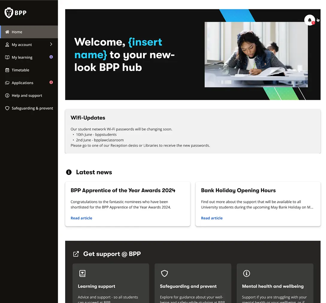
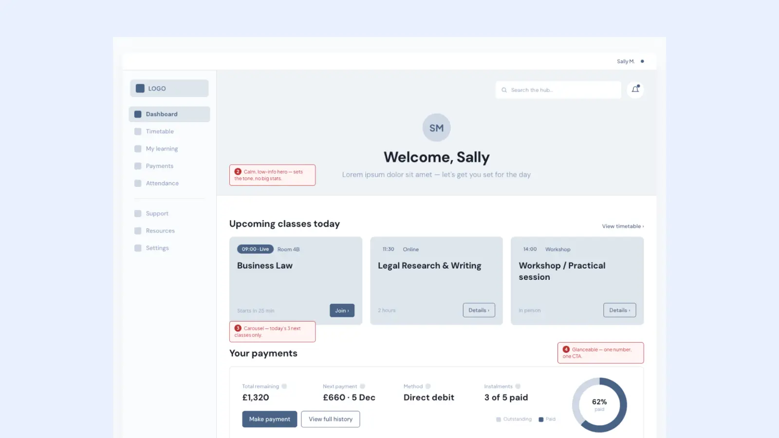
A homepage with links → a dashboard that actively supports students
- 01Surface what matters nowToday’s classes, what’s due, what’s next.
- 02Reduce cognitive loadFewer decisions, fewer clicks.
- 03Personalise as signals improveBuilt to adapt once identity data catches up.
- 04Connect the journeysLearning, payments and support in one place.
- 05Scale with componentsOne system across programmes and campuses.
Mobile: in the moment
On mobile, students are on the move. The same priorities, rebuilt for quick moments: check in to class by scanning a QR code, see what’s next on a week-to-month timetable, act on notifications with a swipe, and get answers from Beep, the AI assistant. A weekly check-in gives the wellbeing team an early signal when someone’s struggling.
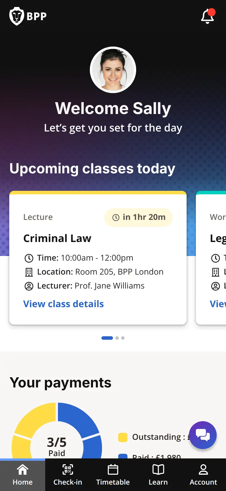
One system, two contexts
| Desktop | Mobile | |
|---|---|---|
| Navigation | Sidebar, every area one click away | Five-tab bar for the essentials |
| Moment | Planning and admin | On campus, in between classes |
| Payments | Full payment flow and history | Progress at a glance, pay in two taps |
| Attendance | Report absences with evidence | QR check-in |
| Support | Find answers hub and AI assistant | Beep chat and notifications |
What would prove it
- More daily visits to the Hub homepage
- Higher payment completion from surfaced reminders
- Fewer support queries as self-service improves
- More students returning to in-progress learning
Next: validate with students across schools and campuses, work with engineering on identity signals, and phase delivery component by component.