Tracy O'Callaghan/ case study
← All workCase study · BPP tutor portal

Redesigning attendance management for 400+ tutors

Attendance at BPP had no real process, and it was taking tutors’ time away from teaching. I led the design of the Tutor Portal’s first release, from concept to MVP.

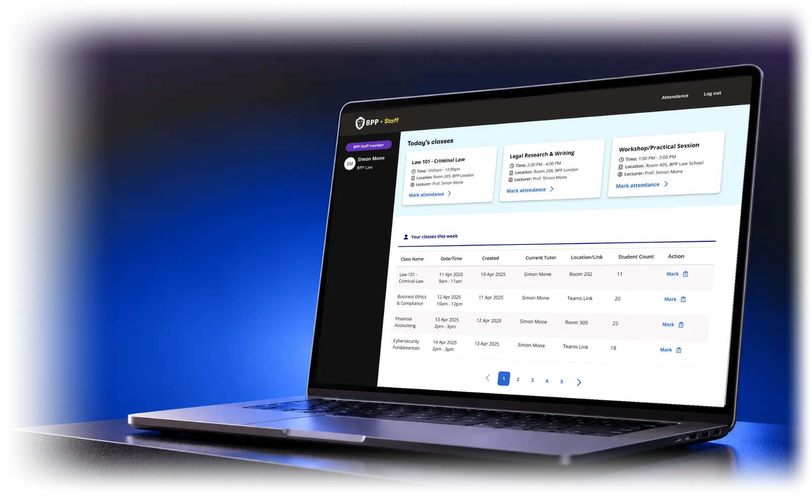
The BPP staff portal dashboard on a laptop: today's classes and the week's classes
Role
Senior product designer. Led design, concept to MVP
Organisation
BPP
Worked with
Product and project leads, engineering (Portugal), service design, attendance and operations teams, tutors
Scope
Slice 1: attendance and class lists. Tutor and admin flows, web
The challenge

Attendance was taking time away from teaching.

Tutors didn’t have time to take a register during class. So some used paper, some spreadsheets, some their own Microsoft Forms, and some did it that night or the next day. The attendance team spent 12.5+ hours a day marking attendance.

Tutors couldn’t see their class size at a glance, or which students had learning support needs or were under 18. For under-18s, attendance is a safeguarding requirement, with registers due by 9:30am.

The opportunity: take the register off the tutor’s plate, so they could get back to teaching.

Discovery

Three kinds of tutor. One shared constraint.

Interviews with tutors and time in classrooms showed one thing held for everyone: there’s no time to run attendance during class. Whatever we built had to work without the tutor.

  • 01Permanent tutorsSame classes every day. They want an overview, and to spot who needs support.
  • 02Part-time contractorsThree or more classes a day. Every minute of admin comes out of teaching.
  • 03Covering tutorsSomeone else’s class, often at short notice.
A key design challenge

Could we trust the attendance data?

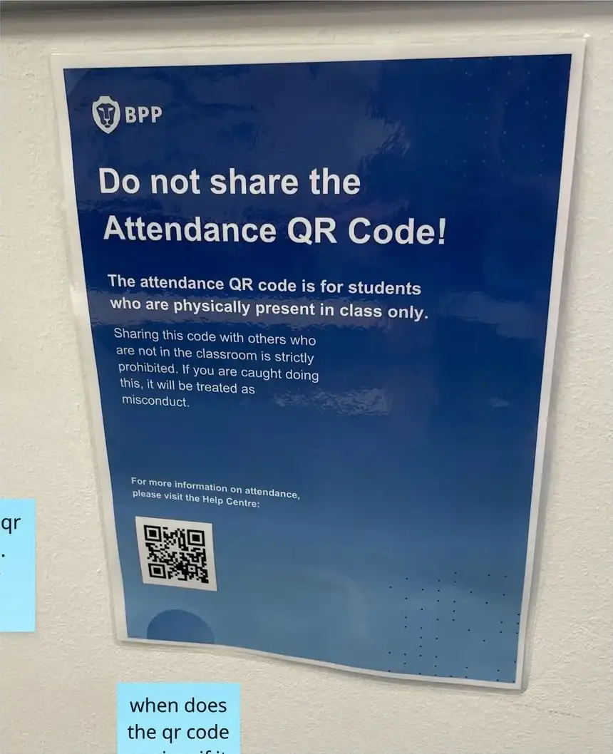
Students photographed the classroom QR code and shared it, so friends could check in from anywhere. Others scanned twice, arrived an hour late, or left at the break.

‘Do not share the Attendance QR Code.’ A warning on a classroom wall.
  1. 01 → The problemCheck-ins alone couldn’t be trusted.
  2. 02 → The design responseTutors validate the register and override any status in real time, from the class.
‘Do not share the Attendance QR Code.’ A warning on a classroom wall.
The solution

Automation by default. The tutor steps in only when it’s needed.

Seven steps, from a tutor’s first visit to a submitted register.

STEP 01 / 07

A guided tour on first visit

The first time a tutor opens a register, a short tour explains QR-based attendance in four steps, then walks through the screen. Guided tour reopens it at any time.

Swipe the screen to change step
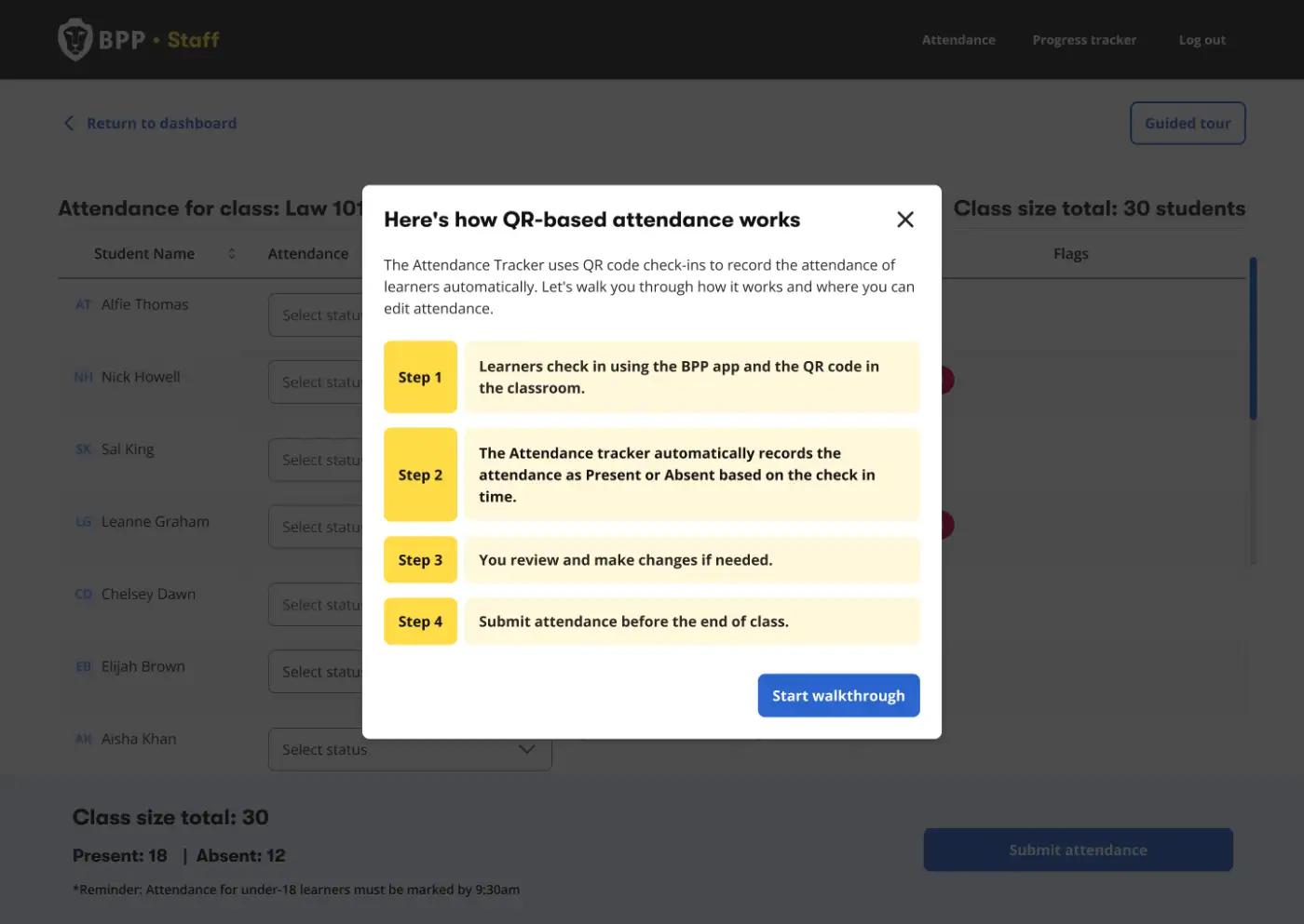
Guided tour intro: Here’s how QR-based attendance works
Designing for adoption

Launching it wasn’t the goal. Getting tutors to use it was.

It had to fit how tutors already worked, so we shaped it with them: 10 prototyping sessions, 2 attendance workshops, and 10+ super users who helped test it. Then three layers of support:

  • 01Guided tourIn the product, the first time a tutor opens a register.
  • 02FAQs and resourcesSelf-serve answers to common questions.
  • 03Live onboarding sessionsWalking tutors through the new process.
Working with engineering

Designed with engineering, not for it.

Specs lived in Figma with shared tokens, and I prototyped the admin search in Figma Make, so it could be clicked through before anyone built it.

The admin view lets the attendance team review the last 3 months of registers and edit attendance, with a reason recorded for every change.

We worked through the flows together in product walkthroughs and open discussion with the PM and engineering, then presented them back to stakeholders to finalise.
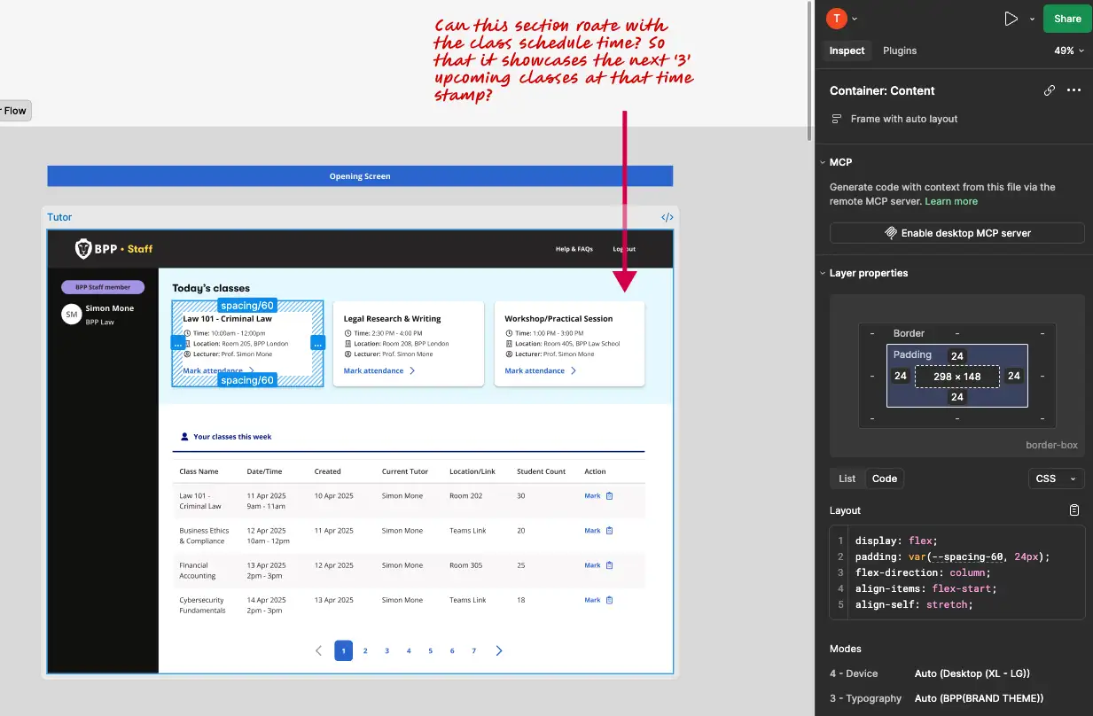
The tutor dashboard in Figma, with spacing tokens in Inspect and a design note on rotating upcoming classes.
Outcomes

Less admin. Better data. More time to teach.

400+tutors onboarded across the university
200+operational hours saved
100%of university tutors can see their full class list
Prototype

See it in action

Two short walkthroughs, one for each side of the portal. Both are built from my Figma screens, and the attendance figures update live as changes are made.

Tutor portalFrom the dashboard to a submitted register. The tutor marks attendance, overrides a QR check-in with a reason, checks a student’s profile and submits. The summary bar keeps count the whole way through.
Admin portalAn admin searches for a class by tutor and date, selects two students and corrects their attendance in bulk. Fields go red until a reason is picked, and the summary updates as soon as the change is made.

Prefer to click through it yourself? Open in Figma →

Reflection

Internal tools deserve the same care as anything customer-facing.

A register is a few minutes of a tutor’s day, but it carries safeguarding duties and a whole team’s workload. Designing those minutes carefully gave time back to both.

“For the first time, all the students stayed until the end of the class. No doubt this portal is going to improve student attendance.”
— A BPP tutor
Next project

I made raising a query easier. Tickets went up.