Tracy O'Callaghan/ case study
← All workEarlier work · 2019–20 · TrackActive Me

Rehab only works if people do the exercises. I designed for that.

TrackActive Me helps people manage muscle, joint and back pain, and is used by insurers, employers and the NHS. I worked directly with the founders and development team, owning the product experience from early concepts through to launch.

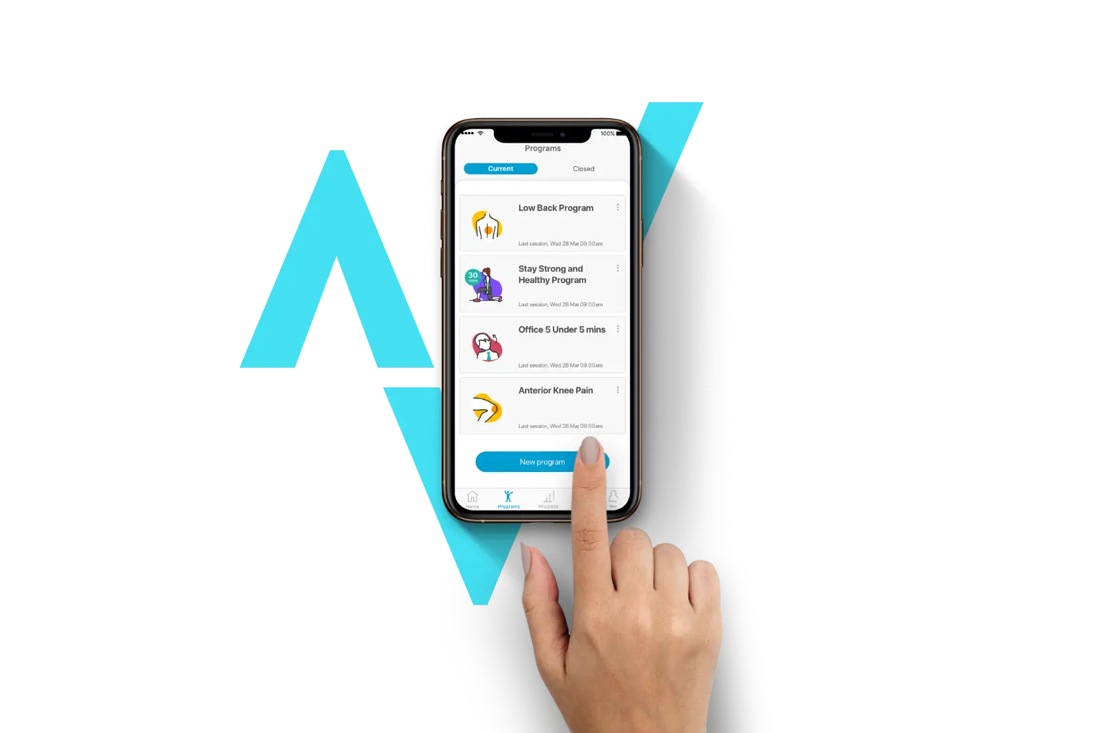
The TrackActive Me app on a phone, showing current programmes, with a finger tapping New program in front of the brand mark
Role
UI/UX Designer (contract)
Company
TrackActive Me, a health-tech startup
Platform
iOS, Android and desktop
Worked with
The founders (a technology entrepreneur, and a physiotherapist who led on health) and the development team
The context

Physio in your pocket, with clinical standards behind it.

TrackActive Me is a registered medical device. Its chat-based assessments, diagnoses and exercise programmes are approved by health professionals and a university clinical governance team. When someone needs more than exercise, it refers them to their GP or a physiotherapist.

That meant the design had to be clear and trustworthy, and it had to work within clinically approved content.
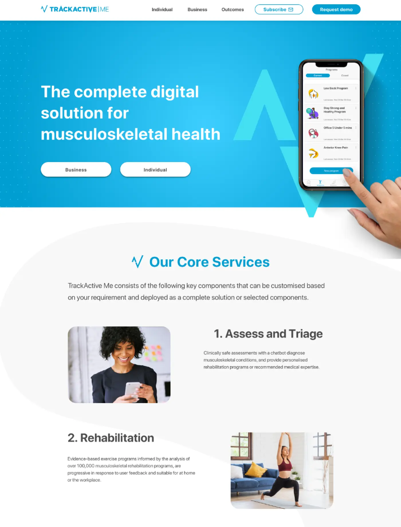
The TrackActive Me marketing site: the hero, and the core services, Assess and Triage, and Rehabilitation
The marketing site, setting out the core services.
My role

What was mine.

  • 01Brand and iconsThe brand style, which I helped develop, and a bespoke icon set I designed
  • 02The end-to-end experienceFrom the chat-led assessment through to a personalised exercise programme
  • 03The design systemThe one the developers built from, across mobile and desktop
  • 04The desktop experienceFor business subscriptions, once further funding came in
  • 05The engagement roadmapReminders and rewards to keep people going past week three
The problem

A recovery plan is only useful if people stick to it.

Programmes asked people to exercise daily, or several times a week. But motivation drops fast, and when people stop, they don’t recover.

Research

The challenge wasn’t the first session. It was the third week.

I looked at competitors and spoke to users. The pattern was clear: people lose interest quickly.

Early discovery and user flows

Early concepts focused on reducing cognitive load and validating information hierarchy before visual design.

Wireframe user flow for signing up and logging in: splash screen, landing pages, sign-up form, access code, notifications, chatbot, Apple Health, login, forgotten password and home
Sign-up and login flow. Click to open full size.
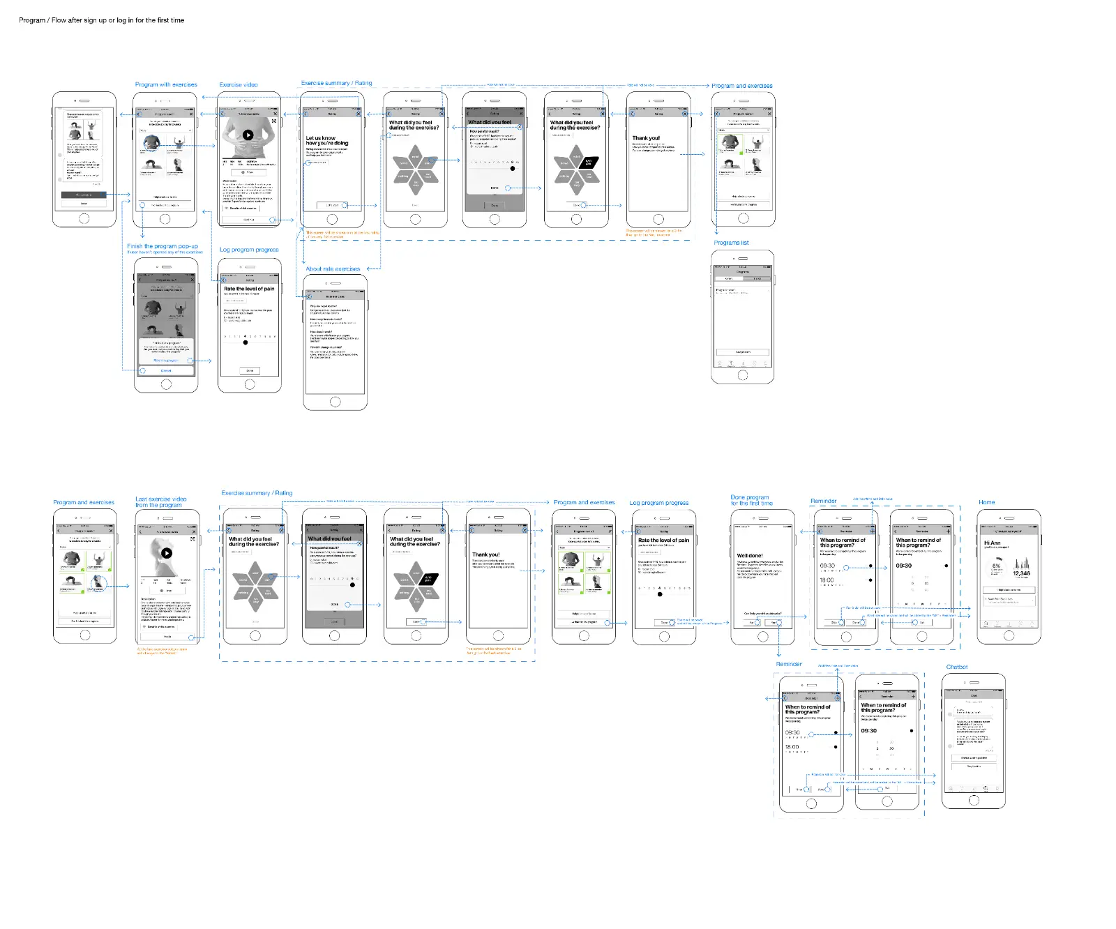
Wireframe programme flow after first sign-up: programme with exercises, exercise video, rating how it felt and pain level, logging progress, finishing the programme, setting reminders and home
Programme flow, after first sign-up. Click to open full size.
What shipped

What shipped.

The redesigned app went live on iOS and Android: a chat-led assessment, personalised programmes, and a brand designed to bring people back.
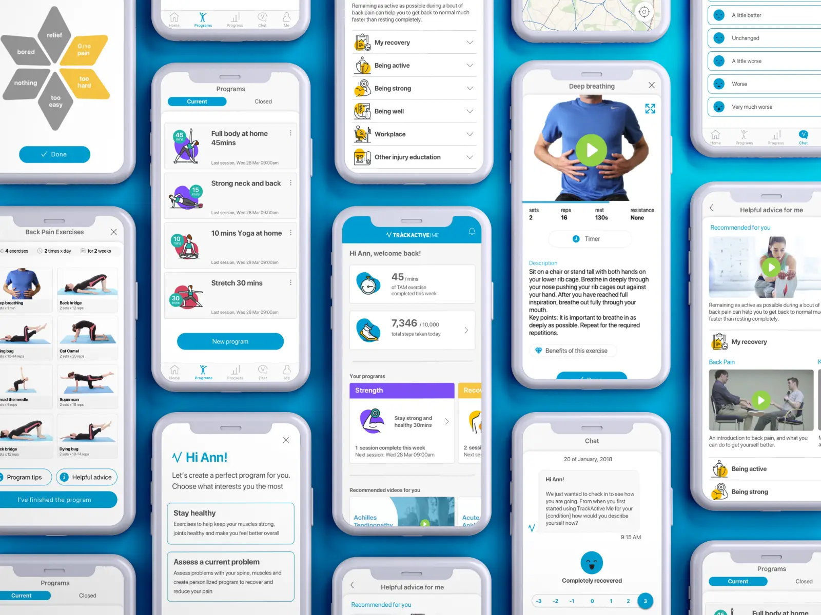
The redesigned app across a spread of phones: programmes, the home screen, an exercise with video, helpful advice, the chat check-in and pain feedback
The redesigned app.

01A brand people would want to come back to.

I helped develop the brand style for the app: an optimistic colour palette, playful illustration and a warm, conversational tone. I also designed a bespoke icon set for the programmes and recovery areas.

The TrackActive Me brand markBranding
Logo, iconography and illustration.

02Design system

I built the design system the developers worked from: colour, type, layout, components and a bespoke icon set, used across iOS, Android and desktop.

Colour and type
Layout
Buttons and selection
Cards
Documented from the original Sketch library and the shipped app, with small refinements. Click to view full size.
The assessment

From ‘where does it hurt?’ to a programme.

A chat-led assessment, built within clinically approved content, that leads to a personalised exercise programme.

Red-flag symptoms, like unusual leg weakness, route people to a health professional rather than to exercises.

Questions used a body chart and photos, so people could point to where it hurt rather than having to describe it.

Choose where it hurts, answer a few questions, then check your movement with a guided video.

Testing
“Fantastic suite of exercises and programmes for the beginner with access to little or no equipment. Helpful videos and explanations to get the techniques correct. Nice graphics too.”
— Google Play review

From programme to check-in: rate how an exercise felt, check in on progress, and if pain is getting worse, find a physio nearby.

Designing for adherence

Getting people back for week three.

Adherence wasn’t just a reminders problem. I designed it into the assessment and the programme, and these features shipped in the live app.

  • 01Reminders built on how habits formPositive reinforcement, encouraging language, and illustrated reminder cards
  • 02A rewards schemeTo keep people consistent through their recovery
  • 03Ratings after every exerciseA quick tap on how it felt, so the programme could adjust
  • 04Check-ins that know their limitsIf someone’s pain was going up, the app suggested a physio and helped them book one nearby, rather than pushing more exercises
What happened next

Launched, then grew.

TrackActive Me launched on the App Store and Google Play in March 2020, and it’s still live today. Further funding meant we could build a desktop version for business subscriptions, which I designed.
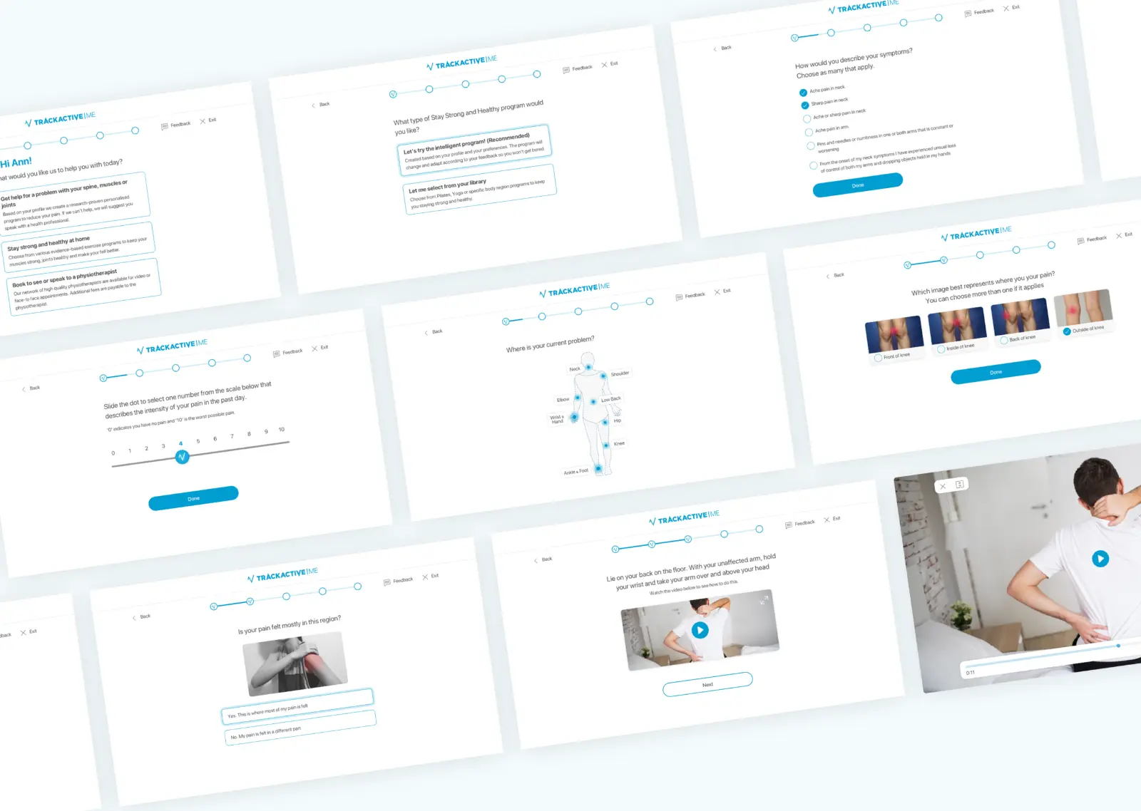
The desktop assessment: choosing what you need help with, marking where it hurts on a body map, rating pain on a scale, and exercise videos
The desktop version for business subscriptions.
Next project

I redesigned an app students only opened when they had to.